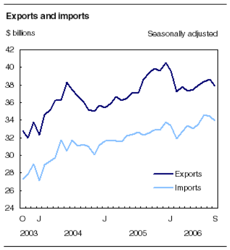
The graph above shows us the level of import & export in China throughout 2006-2003 years.
The Y-axis graph illustrates the total value of import & export in billion dollars, while the X-axis illustrates the years.
As two lines in the graph have very similar slopes, we can tell that both import & export lines are demonstrating generally the same patterns. Thus we can assume that Chinese import and exports are directly related to each other.
2003-2004 starts its export level at $ 33 billion and import level at $ 27 billions. In that year range, lines are mostly increasing, ending in 2004 with a successful rise. However, the start of 2004 year provides us the sinking pattern of both lines, which continues till the middle of 2004. After middle of 2004, graph reports a slight, but continuous increase throughout the 12 months, till the middle of 2005 year. The graph depicts the highest point of import and export of China at the middle of 2005 year. After this point Chinese import reaches its highest $ 33 billions, while export also reaches it's highest $ 42 billions.
After its highest points both export and import make a sudden fall down to $ 38 billions and $ 32 billions respectively. After this fall, both lines start climbing upwards again till September 2006.

The graph shown above contains information about number of passengers using the metro at different day times of day.
The metro usage starts at 6:00 in the morning, with its 100 passengers. According to the given graph, the number of passengers soars up to the 400 people by 8:00 am. It must be explained by the rush hour, when all people try to get to their workplaces. After 8 o'clock morning graph shows a dip to 200 customers by the 10 a.m. Then, graph shows stable rise up to 300 passengers by 14:00 p.m. Afterward, the number of metro users drops down to 100 by 4 o'clock p.m. Then, graph illustrates a spike, which again reaches its highest point of 400 passengers by 6:00 evening, and sharply declines till it's lowest point 100 customers by 20:00 p.m. The next hour passenger number slightly increases to 180. After 9 o'clock p.m., metro stations again reach the 100 passengers level and then metro station closes till the next morning.
The metro usage starts at 6:00 in the morning, with its 100 passengers. According to the given graph, the number of passengers soars up to the 400 people by 8:00 am. It must be explained by the rush hour, when all people try to get to their workplaces. After 8 o'clock morning graph shows a dip to 200 customers by the 10 a.m. Then, graph shows stable rise up to 300 passengers by 14:00 p.m. Afterward, the number of metro users drops down to 100 by 4 o'clock p.m. Then, graph illustrates a spike, which again reaches its highest point of 400 passengers by 6:00 evening, and sharply declines till it's lowest point 100 customers by 20:00 p.m. The next hour passenger number slightly increases to 180. After 9 o'clock p.m., metro stations again reach the 100 passengers level and then metro station closes till the next morning.
Relying on information of graph above, we can assume that rush hours in metro stations are in the morning, midday, and the early evening. It is probably related with going to job place, having the lunch and going to home from job place of passengers.